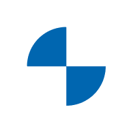

Mobility of The Future – The New BMW Logo
The BMW logo has gone through a handful of changes ever since their first logo back in 1917. BMW just recently redesigned their logo, and its new design is seen as the biggest redesign the brand has ever had.

The new BMW logo retains the same shape, the middle still has the same blue and white colors, however, the font has been shaped differently and the outer ring now has a flat design in white.
Jens Thiemer, Senior Vice President Customer & Brand BMW, explains “The new communication logo radiates openness and clarity. With this new transparent variant, we want to invite our customers more than ever to become part of the BMW world.”
With the introduction of the all electric BMW Concept i4 electric car, the brands new look stands for the mobility of the future and marks the start of the electric revolution at BMW.
In addition, Thiemer explains, “our new brand design is geared to the challenges and opportunities of Digitization for brands. With visual restraint and graphic we are equipping ourselves flexibly for the wide variety of contact points in communication at which BMW will show its presence online and offline in the future.”
BMW shares with us the evolution of their logo over the past century.

The BMW Concept i4 represents a look ahead to the BMW i4, which is said to enter production in 2021. BMW USA News shares with us what we need to know about the new pure-electric Gran Coupe which will be the BMW Group’s first all-electric model in the premium midsize class. Stop by our dealership and explore our large inventory of new and pre-owned vehicles. Schedule a service online or contact us with any questions or concerns you may have. We look forward to seeing you at our BMW dealership located at 599 Middle Country Road, Saint James, NY!
0 comment(s) so far on Mobility of The Future – The New BMW Logo